Samsung Digital Harmony:
Moments Mode concept project
Millennials recognize the paradox between both needing and feeling bound to their phones – they need a tool that helps them disconnect just enough to focus on their present moment.
Working with a team of 4 other designers, our objective was to create several concepts for Digital Harmony to propose for the Galaxy11.
role
research | prototyping | concept testing

From research to design concepts
We started with understanding who are users are, identifying their underlying motivations and needs, examining the competitor features, and finishing with the opportunities and concepts.
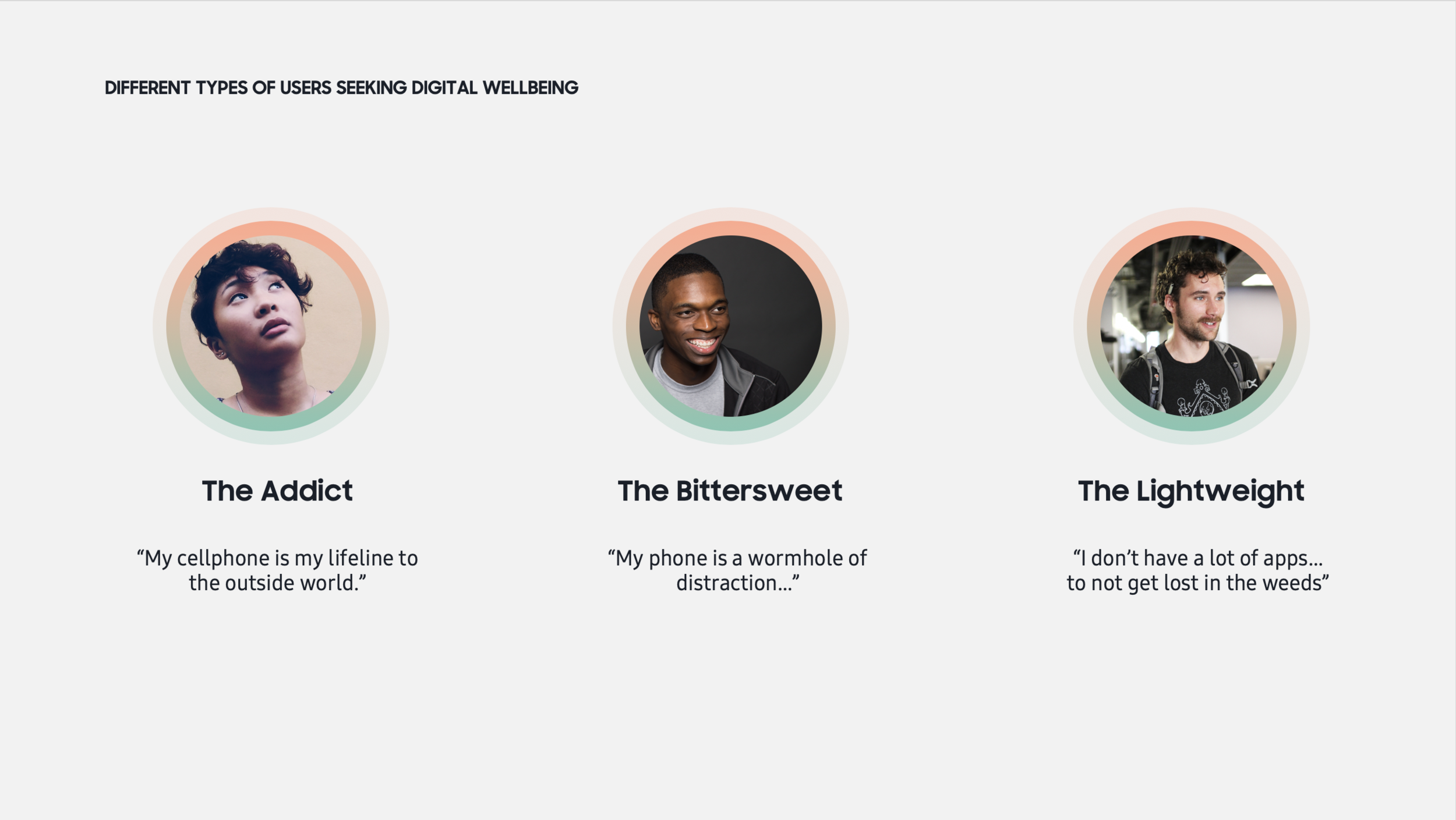
In-person interviews and secondary research, led us to 3 core personas:
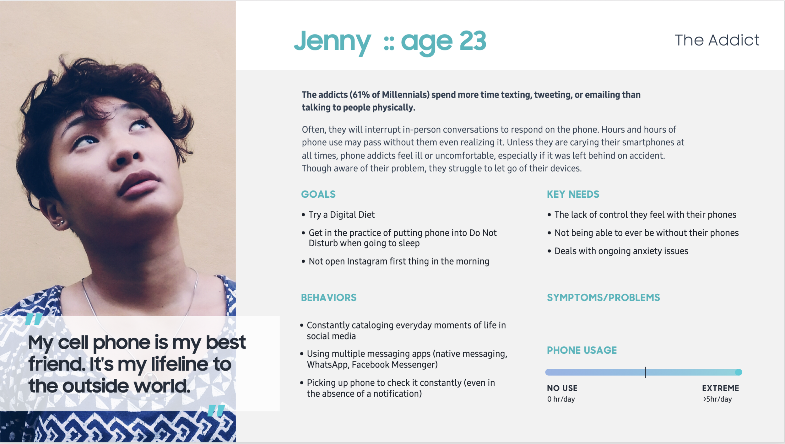
The Addict – “My cellphone is my lifeline to the outside world.”
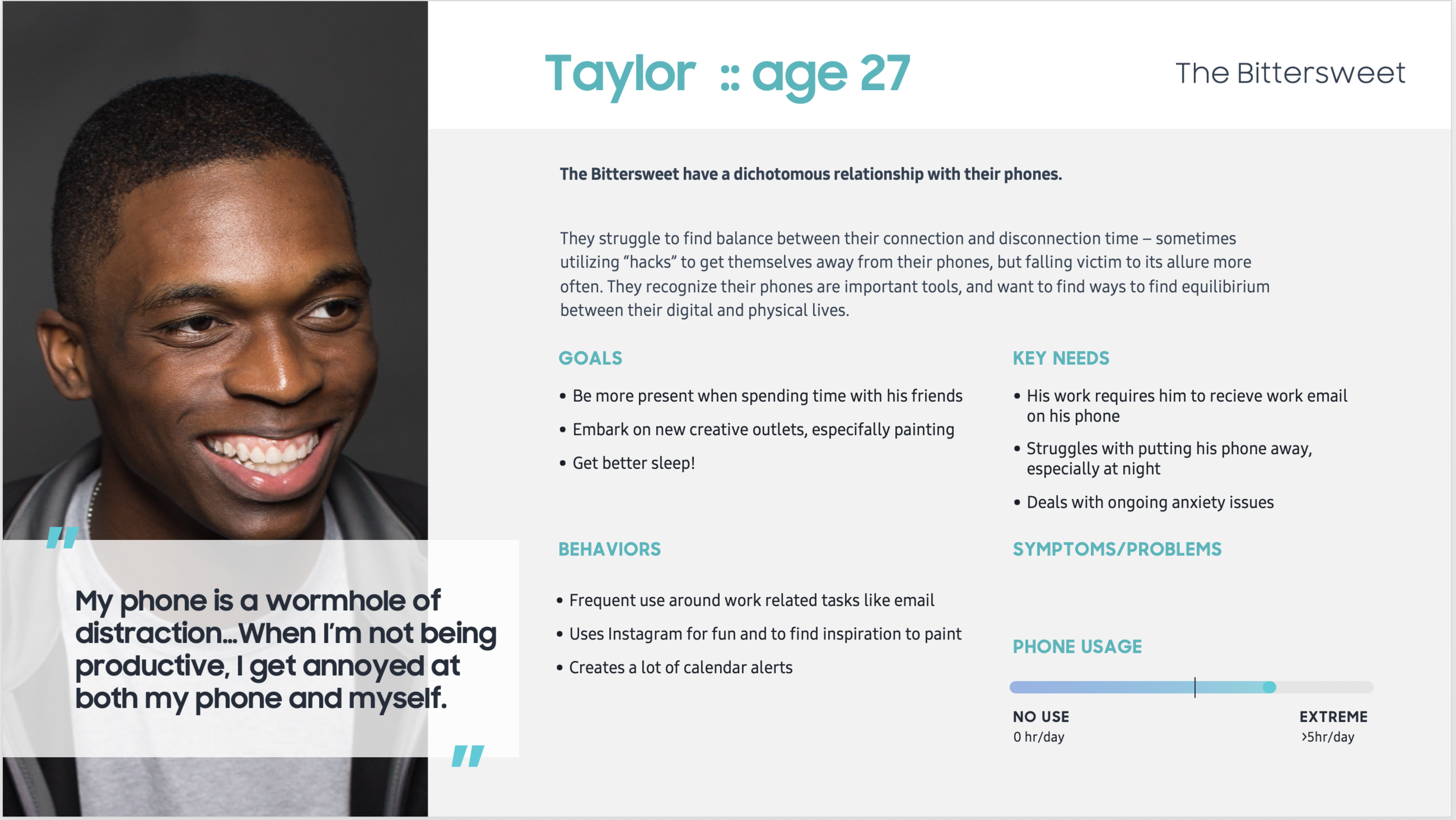
The Bittersweet – “My phone is a wormhole of distraction.”
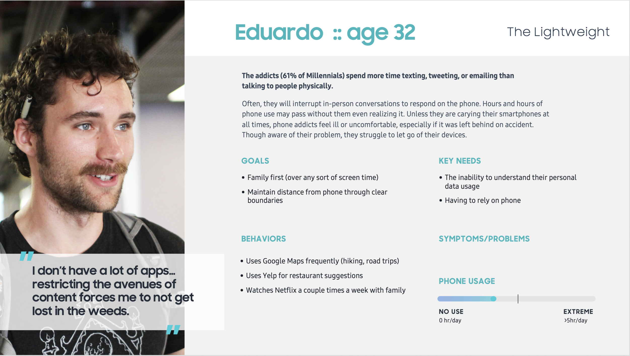
The Lightweight – “I don’t have a lot apps so I don’t get lost in the weeds.”
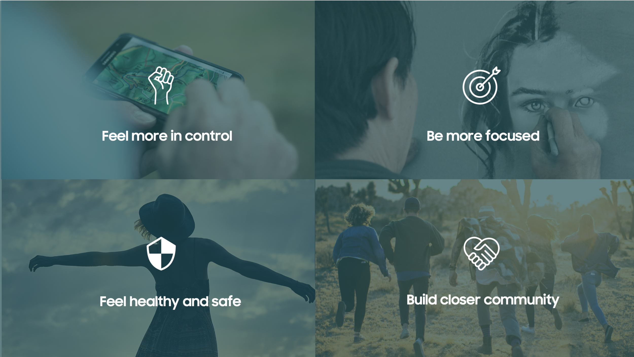
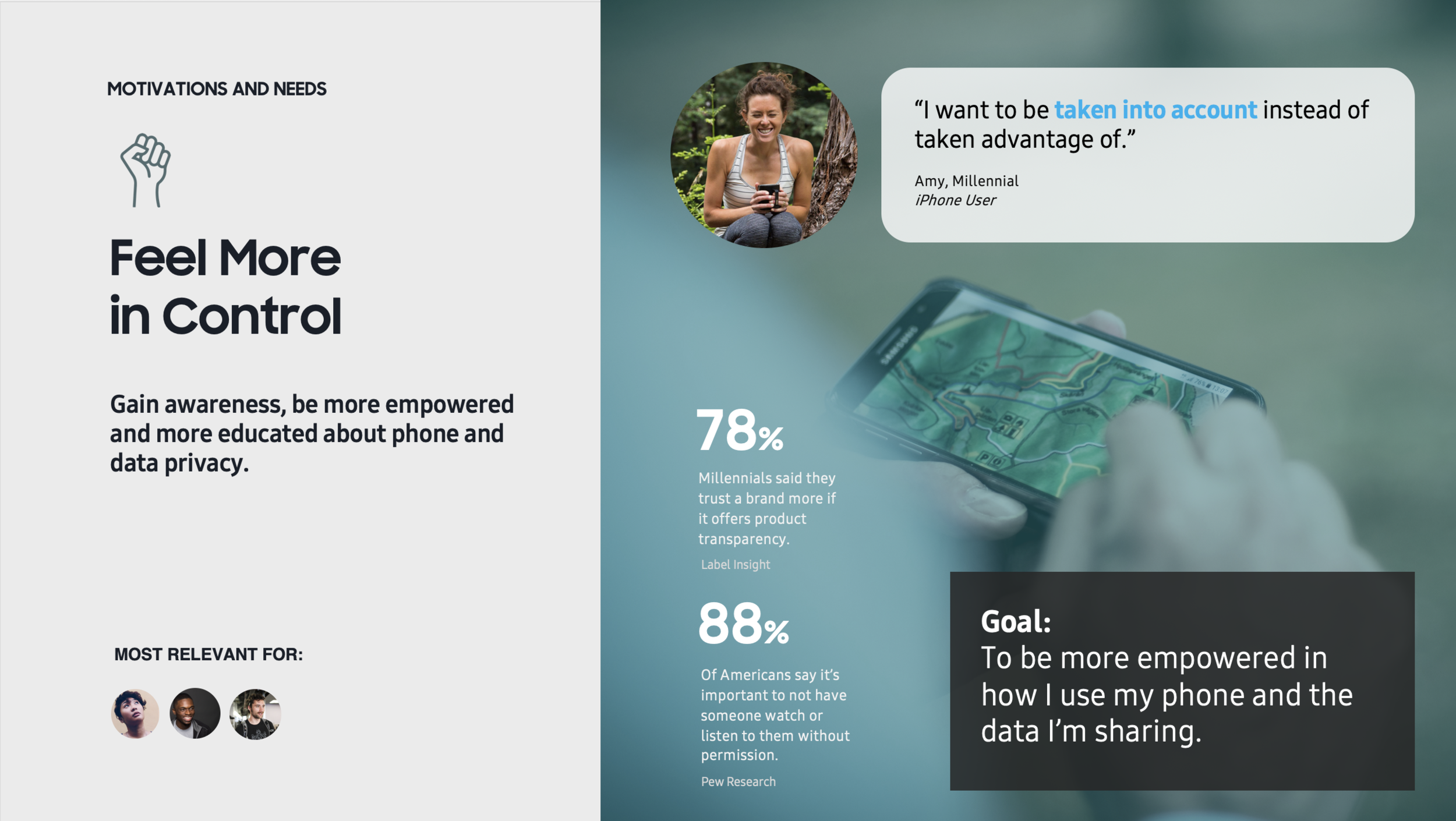
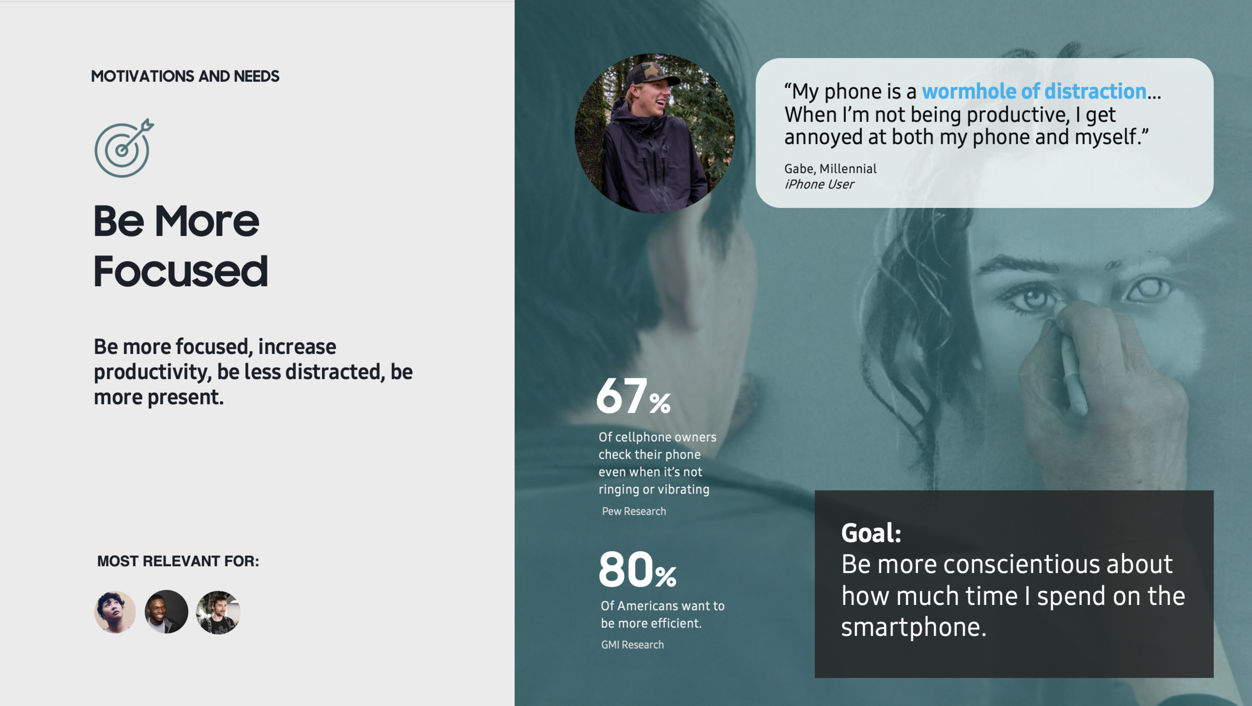
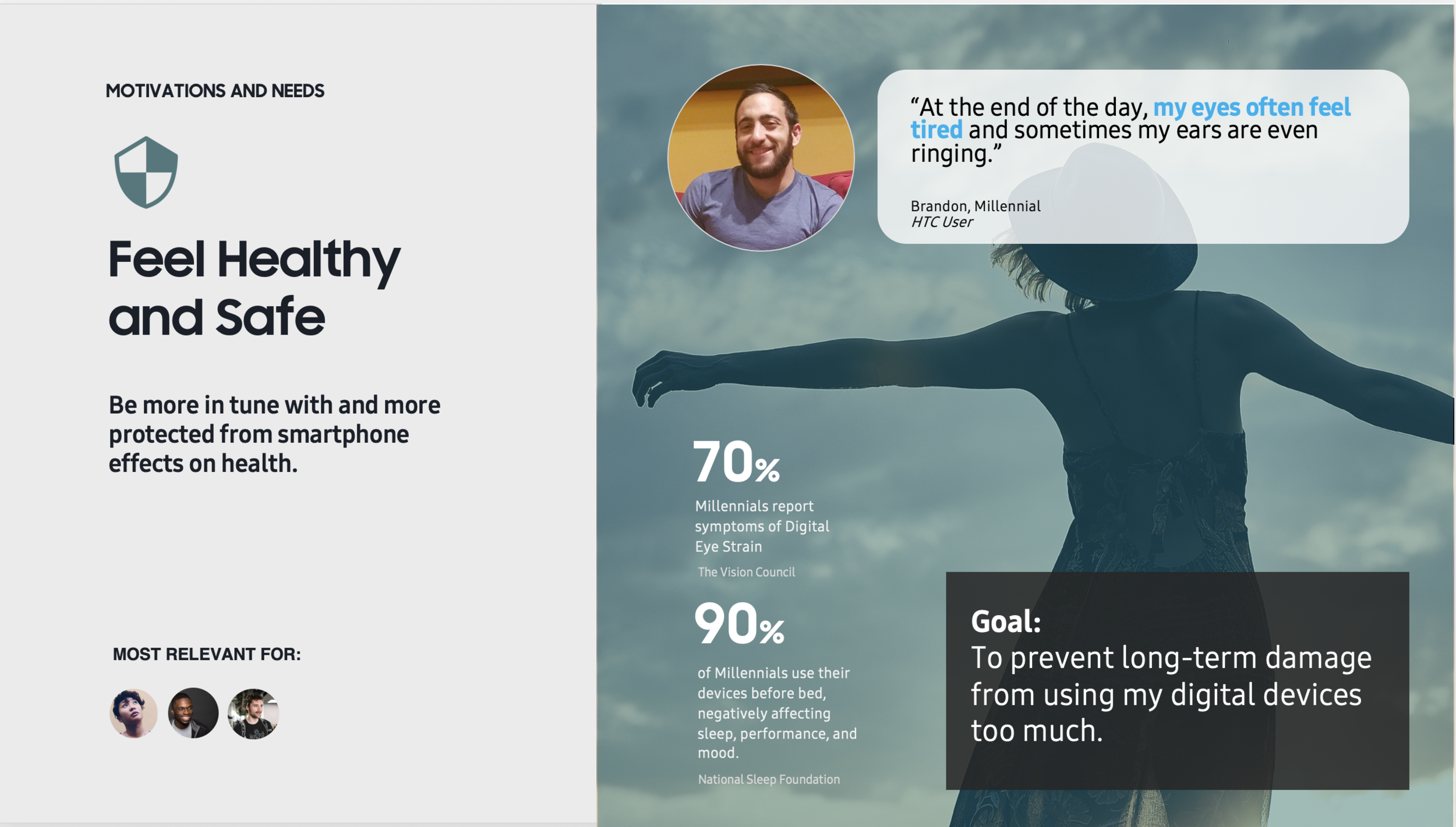
Key needs and motivations identified
Users want to feel more in control, be more focused, feel healthy and safe, and build closer community.
We examined both Google and Apple’s approach to digital wellbeing, noting where our opportunities existed. We explored their features with a critical eye, understanding what they’re goals are while also recognizing what problems exist.
We used this feature analysis to help guide us in our opportunity mapping.
Competitors: What can we do better?
Opportunity mapping
Using the motivations + needs, we identified the process of a user going through their own flow of understanding, using awareness, reflection, motivation and actions as the key points along the way.
The resulting opportunity areas fed a much larger range of concepts, though I’m only focusing on one, Moments Mode in this case study.
Concept description + storyboard
Moments is an intentional way to lightly disconnect. Users select a set time and activity they want to embark on, whether it’s hiking or eating out with friends. Based on the activity, users are given access to a select set of apps and notifications. Additionally, the phone enters a predominantly black and white dark interface to further reduce distraction.
Moments Mode lets you be present with the activity you are engaged in.
We opted for predominantly black UI to make the phone less distracting, since bright colors are one of the key tools in keeping us glued to our phones. The whole idea was focused on simplicity, so limiting access and reducing the distraction of the experience overall was critical.
Initial + final concepts
From the Quick Panel, users can enable Moments. This screen represents the initial ideas for what would be included, and how users could customize their “light disconnection.”

Users can enable or disable which apps they want in their experience. Overtime, the mode would adapt to user preferences, knowing in advance what are the preferred settings for each type of moment.
MAIN FLOW

Users select which type of moment they want to start.

This is the moments home screen once it’s been activated. Users can only access what they see here on the screen.

Once they “exit moments” users arrive at this summary screen, showing how long they were present.

Instead of all notifications flooding at once, notifications are re-designed, only showing what matters on the top.
ACCESS + SETTINGS
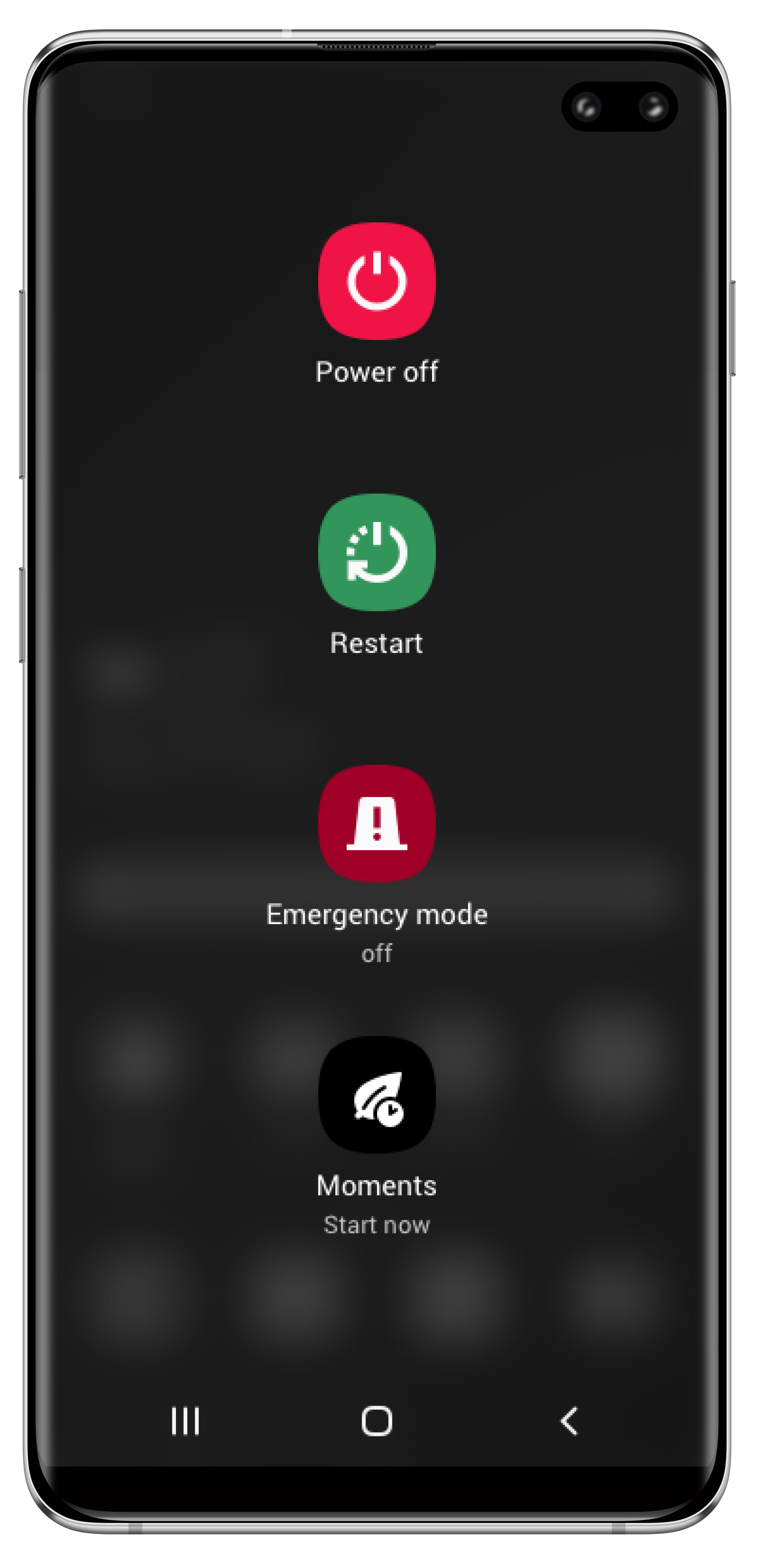
Users can enable Moments by holding down the right side button.

In settings, which apps and notifications allowed can be set.

Moments can be accessed via calendar as well.

Users can set a calendar event specifically to turn on Moments once it begins.